
3x3: Illustrators, Hoopers, and Severance’s Weird-Ass Offices

I like information in clusters of three. I’m a generalist by nature, so this helps me dig into the stuff I’m thinking about and frame it. It could be brand design, NBA fashion, or the latest comics creators. Whatever’s rattling around in my head this week—this is where it lands.
This week, it’s all over the place: illustrators whose work I admire, NBA players I will irrationally defend, and the unsettlingly perfect art direction of Severance.
1. ILLUSTRATion WIZARDS
The great tragedy of being a designer is that when you see something really, really good, your first thought isn’t always wow, this is great. Sometimes, it’s damn, I wish I made that. Here are three illustrators whose work does that to me on a regular basis.
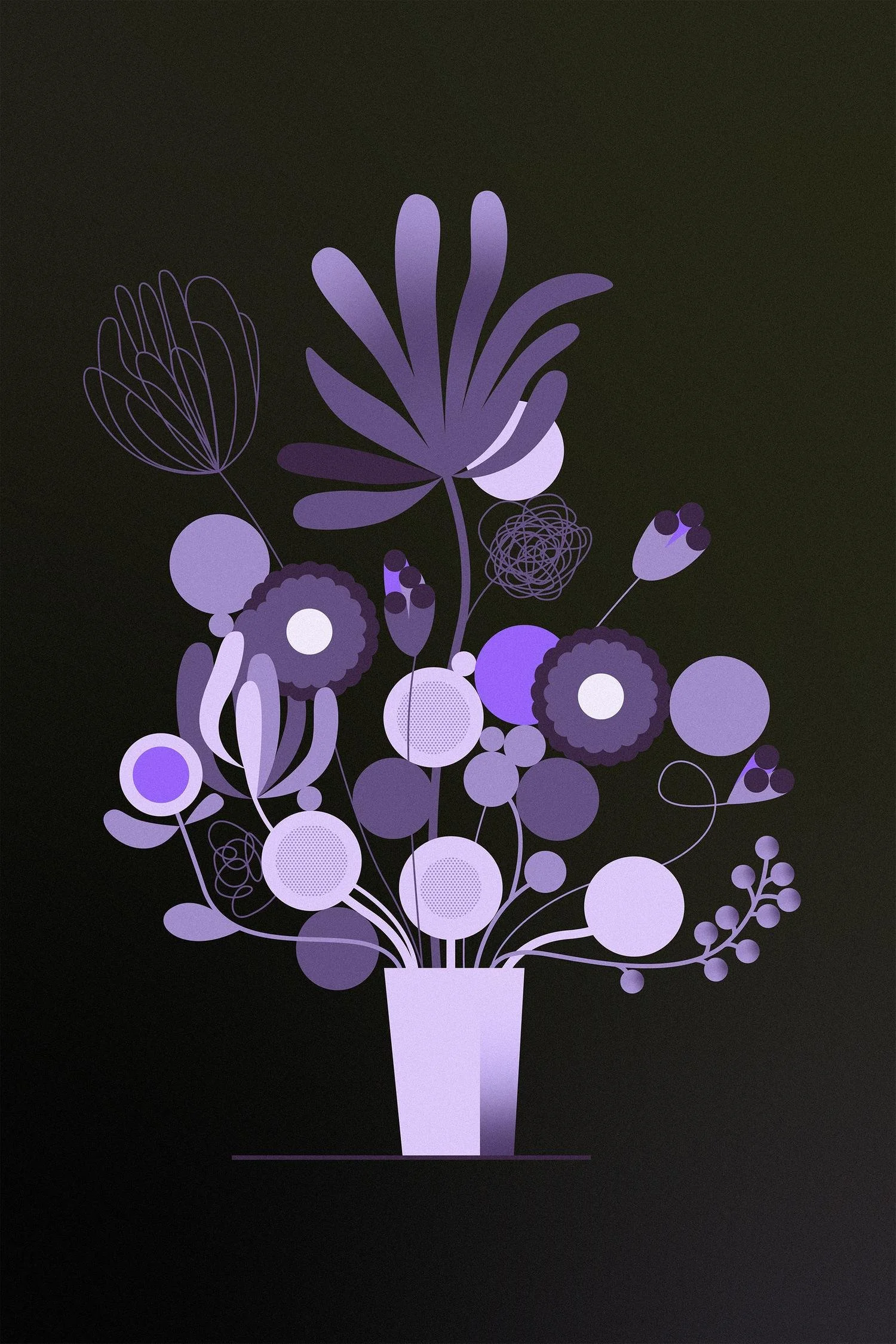
1.1 The Queen of Bold & Bright


Lisa Congdon’s work makes me happy. No, really. Look at it. It’s like if folk art was hyper-intelligent and got into a good MFA program but refused to lose its DIY spirit. The colors? Perfect. The typography? Spot-on. The way she balances vibrancy with warmth? Chef’s kiss. And she’s self-taught, which makes her one of those "no excuses" people. You see her work, and you want to go make something immediately.
1.2 Noted Philadelphian Illustration Villain
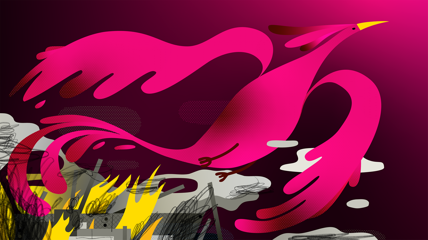


Unfortunately, I know Alex personally. He is from Philly and I am from Boston. Natural enemies. We met while teaching at Parsons The New School and I’ve been following his work ever since. He is a wizard with color and shape. His work looks deceptively simple, which is exactly why it’s genius. The man is out here doing the most with the least. An illustrator’s equivalent of Tim Duncan’s bank shot. There’s a looseness to his work that makes it feel alive, like it’s breathing on the page. It’s funny without being goofy, expressive without being fussy. Just the right amount of chaos in the composition.
1.3 Unsheathed Liquid Sword.


Denys Cowan’s lines are so deep with feeling. He’s an artist that is so comfortable in his point of view that it can’t be confined. Even ruled lines simmer with inky expression. His work on Hardware alone puts him in the hall of fame. He’s got this controlled looseness, a little bit of scratchy humanity that makes everything feel kinetic. If you like comics that look too clean, you probably don’t get it. But if you love the way a good brush stroke can make a panel feel like it’s in motion? Welcome to the church of Denys Cowan.
2. NBA PLAYERS on my radar

2.1 The villain We Deserve
When Dillon Brooks played for the Grizzlies he talked a lot of shit then promptly getting eviscerated by Lebron. It left an impression on me and Memphis GM Zach Kleiman who promptly traded him. I did not like Brooks. As Houston has become a real tough play-off out, I’m growing to appreciate him. A lotta guys would not have recovered from his embarrassing exit from Memphis. Also the league needs villains with very punchable faces. His Lambierian mug fits the bill and I appreciate that. With noted, ahem, heartbreaker Ime Uduka, Brooks has helped make the Rockets legit. He plays basketball like he was cast as "the bad guy" in an And1 Mixtape Tour movie from 2004. He exists purely to annoy people. And the best part? He doesn’t care. He knows you hate him. He wants you to hate him. That’s his fuel. He’s out here getting ejected, talking trash, wearing fur coats, and I have come to love every second of it.
2.2 A Player You Hate Until He’s on Your Team
Speaking of the Rockets, the guy who should have gone there and been their centerpiece is lacing them up for the Warriors. Jimmy fucking Buckets. I love a two way player. He has the personality of a gym teacher who takes pickup games way too seriously, and I respect that. Well, sometimes. Jimmy is getting a little long in the tooth and the guy who chopped up the Timberwolves starters while playing with the bench players at practice just to show how soft they are, might be gone. That said when Jimmy is motivated he is dangerous. Now he’s not mad. He got that fat check he wanted. I’m hoping to see one last great Jimmy Buckets run. When he’s his perfect Pokemon form, he doesn’t play basketball. He fights basketball.
2.3 The Guy You Never Notice Until He’s Killed Your Team
I’m a Boston guy so there’s always gonna be a Celtic on here. Derrick White is what happens when a player is too good at too many things to be flashy. He’s a world-class defender, an underrated shooter, and just unshakably solid in a way that makes coaches lose their minds with happiness. You look up at the scoreboard, and he has 22 points, 5 assists, and a game-saving block. He’s like a good bass player—you don’t always notice him, but without him, the whole thing falls apart.
3. SEVERANCE: CORPORATE HORROR DONE PERFECTLY

Severance is the scariest show on television, and it doesn’t have a single ghost, monster, or demon in it. What it does have is a workplace that feels just slightly off in a way that makes your skin crawl. Also: I find is soothing? Beautiful color palettes and immaculately curated retro devices. I love looking at it even if it’s a nightmare. David Lynch is smiling from weirdo heaven down on all of this. The show’s visual storytelling is really unlike anything out there. Ben Stiller deserves a lot of credit but there’s some great folks working with him.
3.1 The Man Who Made It Feel Real (and Awful)
Production designer Jeremy Hindle turned a regular office into a nightmare maze. The Lumon office is too clean, too big, too empty. Every hallway looks like it could loop forever. The break room? The scariest place on TV. The show’s whole vibe is "what if your office was a prison, but everyone just accepted it?" Hindle nailed that oppressive feeling of corporate mundanity.
3.2 The Glitch in the Matrix

You know those deeply unsettling animated faces in the Severance opening credits? That’s Oliver Latta. His 3D animations feel like AI-generated nightmares—faces stretch, bodies melt, and everything moves just a little too smoothly. It’s the perfect visual metaphor for the show: human, but off. His work makes the uncanny valley feel like home. Believe it or not his personal work is even more bizarre. I love it.
3.3 The Art Director Who Tied It All Together
Good art direction isn’t just about making things look cool. It’s about making them feel cohesive. Angelica Borrero’s work on Severance does exactly that. The brutalist office. The pastel mundanity of Kier Eagan’s propaganda. The weird, weird party decorations. Every visual choice tells the same story: this world isn’t quite right, but you can’t put your finger on why.
That’s this week’s 3x3—illustrators, hoopers, and corporate dystopias. If you haven’t checked out any of the above, fix that immediately. And if you see Dillon Brooks in a fur coat, know that he’s about to drop 30 and talk a lot of trash while doing it.
+++